

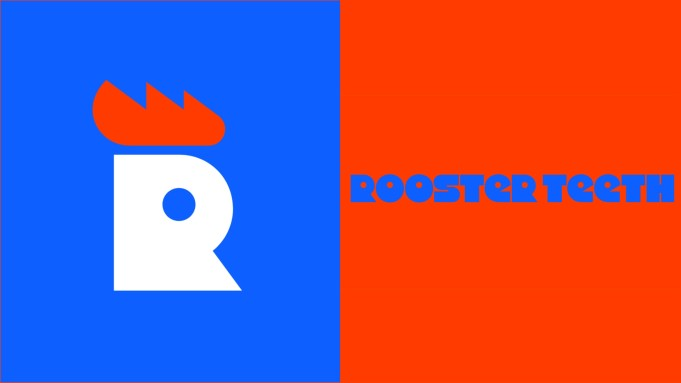
In an absolutely unexpected move the American studio best known for Red vs Blue and cancelling Red vs Blue, Rooster Teeth, unveiled a brand new lawsuit in form of a logo that’s blatantly stolen from an Australian fast food restaurant.
Richard Dentals, President of Brand Expansion, had this to say in an interview with whomever, because honestly, if that’s how much work an international media company puts into their logo, we clearly put too much pressure on ourselves to provide sources.
“The team at Rooster Teeth is proud to announce a never-before seen lawsuit that basically nobody’s asked for. Our graphic designer, who is also our lawyer, has been preparing this for all of their state-mandated 30-minute lunch break, and we cannot wait to share more details!”
Company co-founder and voice of three funny purple-adjacent guys and one serious character in Red vs Blue, Matt Hullum told a news source: “Probably we’ve been a little bit overdue for a fresh coat of paint because we’ve been so busy evolving and staying ahead of new allegations popping up and further destroying our reputation.” The new Rooster Teeth branding is aimed at preserving the company’s original spirit of playing around with friends and pretending that problems inside the company don’t exist, he said: “It’s always been about fun. And using transparent smokescreen tactics to divert attention from actual problems by announcing a logo so bad the internet will complain only about it. Or, uh, fun!”
The internet took on the announcement like it usually does, with an equal mix of bewilderment, outrage and sarcasm. Twitter responses to the announcement could almost be considered cruel, but then again, what RT did to their employees was even crueler. Even the /r/roosterteeth subreddit, known for being the most unfunny corner of the internet about a comedy website, started mocking it.
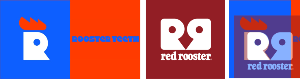
But the logo being bad and the internet mocking it isn’t the most newsworthy thing about the announcement. The lawsuit is, which is coming from an Australian fast food restaurant chain Red Rooster for blatantly ripping off their famous logo. Here’s a comparison:
We spoke to a local high-school freshman and novice graphic designer Simon, who was incidentally the only person in a 50-mile radius who knew that Illustrator didn’t stand for a low-paying job out of art school. “This logo… It’s really something, you know. Every designer hopes to become someone who could design this for a company in 15 minutes and spend the remaining two weeks of the deadline snorting coke. I’m only joking of course, I’m positive the graphics designer spent two months laboring over literal hundreds of vastly superior designs that all got morphed into this abomination opposite colors and uncentered text purely by corporate meddling and out-of-touch suits doing meaningless changes.” When we asked Simon if there’s any positives to the logo, he said cheerfully: “Actually, the eye-immolating colors helped me notice that my two computer screens displayed red/orange slightly differently. Thanks for that, I guess!” Before Simon went off to calibrate his monitor color settings, we asked him if he could do a couple of mockups for a better logo. “Uhh, sure, I see that ‘minimalism’ was an idea for the new logo, so I could try something. I don’t have my tablet, though, so I’ll do it with my mouse.”
In actual seconds, he sent us these two minimalist logo ideas.
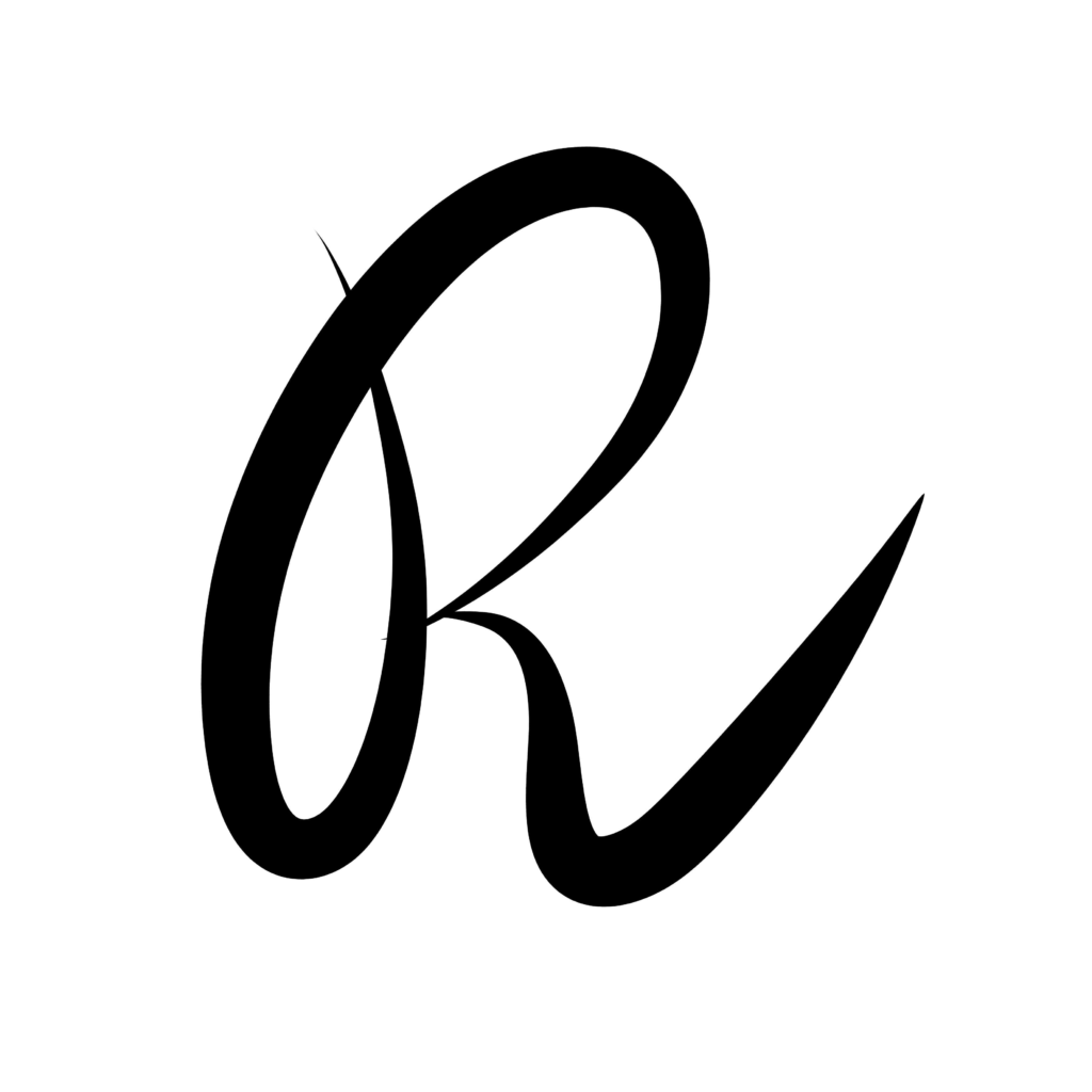
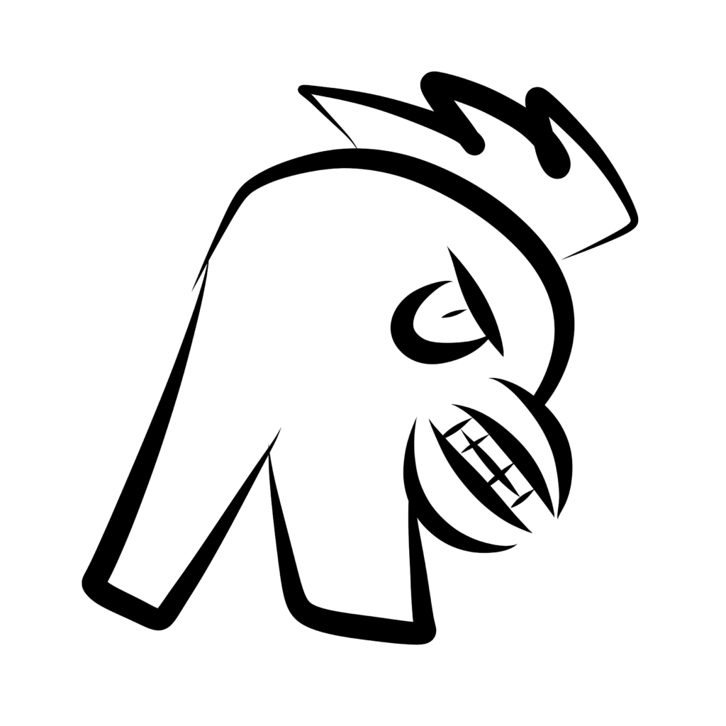
Simon added: “I like the second one. Looks like an Among Us guy if you squint enough.”